Wythe Blue and Palladian Blue are two popular paint choices for creating a soothing atmosphere in your home. Discover the differences and choose the perfect shade for your space.
**Wythe Blue vs Palladian Blue: Choosing the Right Blue Paint (Navigate Between Wythe and Palladian Blue)**
Wythe Blue vs Palladian Blue: Choosing the Right Blue Paint (Navigate Between Wythe and Palladian Blue)
**Direct Answer:** When choosing between Wythe Blue and Palladian Blue, consider the undertones of each color. Wythe Blue has a green undertone, giving it a fresh and calming feel, while Palladian Blue has a blue-green undertone that is more versatile and works well in various lighting conditions.
Understanding the undertones of both colors will help you decide which one will complement your space best.
To make the best decision, test both colors on your walls and observe how they look throughout the day in different lighting conditions.
Additionally, consider the other elements in your room, such as furniture and decor, to ensure the chosen blue paint will harmonize with the overall look.
By being organized and thoughtful in your selection process, you can confidently choose between Wythe Blue and Palladian Blue for a beautiful result.
—
| Wythe Blue | Palladian Blue |
|---|---|
| Green undertone | Blue-green undertone |
| Calm and fresh | Versatile and adaptable |
—
When it comes to choosing the right shade of blue paint for your home, two popular options that often come up are Wythe Blue and Palladian Blue. These shades offer a soothing and elegant look that can transform the atmosphere of any room. However, there are differences between the two that can impact your choice. Let’s delve into the nuances of Wythe Blue vs. Palladian Blue to help you make an informed decision.
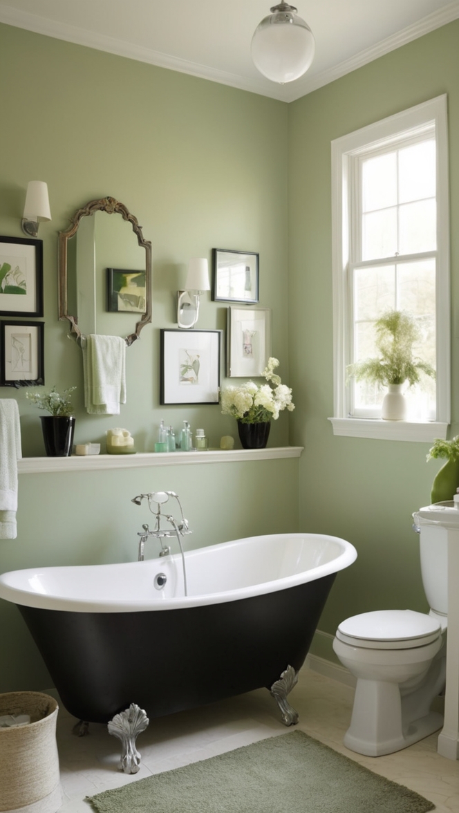
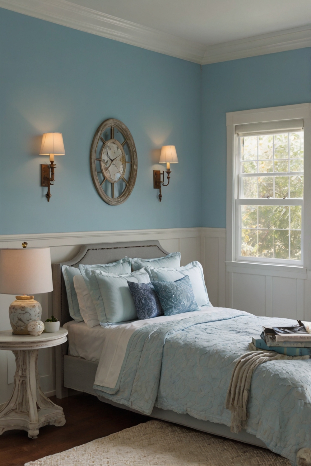
Wythe Blue and Palladian Blue are both beautiful shades of blue paint, but the main difference lies in their undertones. Wythe Blue has more of a green undertone, giving it a soft, muted appearance that works well in both traditional and contemporary spaces. On the other hand, Palladian Blue has a hint of gray and a slightly cooler undertone, offering a more serene and airy feel.
To determine which shade would work best in your space, consider the lighting conditions. Wythe Blue tends to work well in rooms with plenty of natural light, as the green undertones can come alive in bright spaces. Palladian Blue, with its cooler tones, is suitable for rooms with less natural light, as it can help brighten up darker areas.
While using Wythe Blue and Palladian Blue together in the same room is possible, it’s essential to consider the overall aesthetic you want to achieve. Mixing these shades can create a harmonious and layered look, especially when paired with complementary colors and textures. However, be cautious not to overwhelm the space with too many competing elements.
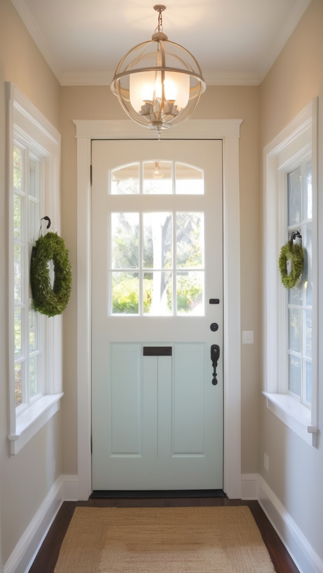
The benefits of using Wythe Blue in a room are abundant. This color can evoke a sense of tranquility and sophistication, making it a popular choice for bedrooms, living rooms, and even kitchens. Wythe Blue also pairs well with a variety of other colors, such as whites, grays, and neutrals, allowing for versatile decorating options.
When choosing between Wythe Blue and Palladian Blue based on your room’s lighting, consider the following: In well-lit rooms, Wythe Blue can bring a sense of freshness and vitality, while Palladian Blue can create a calming and peaceful ambiance in dimmer spaces. Take into account the orientation of windows and the time of day when natural light is most abundant to make an informed decision.
Selecting the wrong shade of blue paint for a room can have its risks. A color that clashes with the room’s existing decor or lighting conditions can throw off the overall balance and harmony of the space. To avoid this, test paint samples on the walls and observe how they look throughout the day to ensure they complement the room’s aesthetic.
To ensure a cohesive and well-coordinated look when using both Wythe Blue and Palladian Blue in your home decor, follow these tips: Start by choosing one shade as the dominant color and the other as an accent. Use Wythe Blue for larger surfaces like walls and ceilings, and incorporate Palladian Blue through accents like furniture, pillows, or artwork. Balance the two shades with a neutral base to tie the room together seamlessly.
In conclusion, deciding between Wythe Blue and Palladian Blue involves considering factors such as undertones, lighting conditions, and overall room aesthetics. By understanding the unique characteristics of each shade and how they interact with your space, you can confidently choose the right blue paint for your home. Whether you opt for the calming elegance of Wythe Blue or the serene charm of Palladian Blue, both shades offer timeless beauty and versatility that can elevate any room’s design.