Looking to elevate your home decor with a strategic color scheme? Explore the essence of color theory and branding.
Disclosure: This post contains affiliate links. We may earn a commission at no extra cost to you.
**What is the best way to incorporate a color palette design into your home décor?**
**Color palette design** involves selecting a cohesive set of colors to use throughout your home. To incorporate this design into your décor, start by choosing a main color and then selecting complementary shades. Consider factors like lighting, room size, and existing furniture when choosing colors. Utilize paint, textiles, furniture, and accessories to bring the palette to life. Experiment with different shades and patterns to create a cohesive look that reflects your personal style. Keep in mind that using too many colors can lead to a cluttered look, so it’s best to stick to a few key hues.
Incorporating a color palette design into your home décor can be a fun and exciting process that allows you to express your personal style and create a space that reflects your personality. As a homeowner, I have had the opportunity to experiment with different color palettes in various rooms in my house, and I have learned a few valuable lessons along the way.
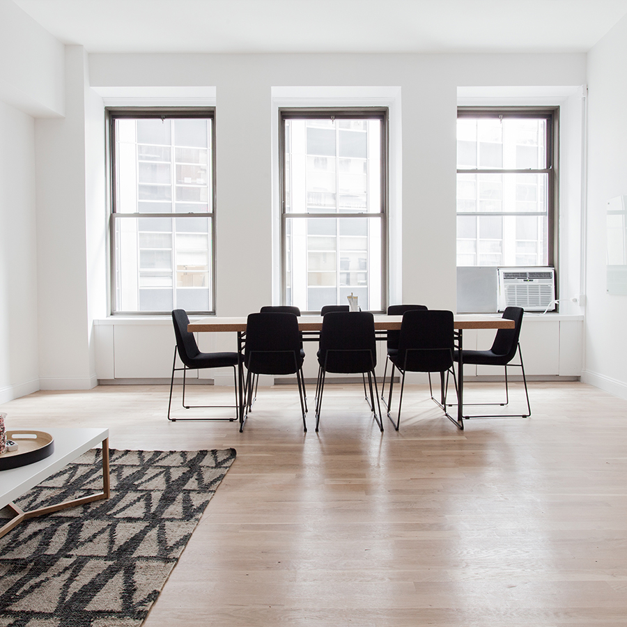
When it comes to selecting a color palette for home décor, one of the essential factors to consider is the room’s function. For example, in my living room, I wanted to create a cozy and inviting atmosphere where my family and I could relax and unwind. I opted for a warm color palette consisting of earthy tones like browns, beiges, and terracotta. These colors helped create a sense of comfort and warmth in the space, making it the perfect spot for movie nights and family gatherings.
Another crucial consideration when choosing a color palette is the amount of natural light in the room. In my bedroom, which receives plenty of natural light throughout the day, I decided to go with a light and airy color palette to enhance the brightness of the space. I chose soft shades of blue and white to create a tranquil and serene environment where I could unwind and recharge after a long day.
When incorporating a color palette design into different rooms in the house, it’s essential to pay attention to the existing furniture and décor. In my kitchen, which features sleek white cabinets and stainless steel appliances, I wanted to add a pop of color to liven up the space. I decided to introduce accents of vibrant red through accessories like a toaster, kettle, and dish towels. This bold color choice added a touch of personality to the room and created a focal point that tied the whole design together.
While sticking to a strict color palette can create a cohesive look, I have found that mixing and matching different colors can add depth and dimension to a space. In my home office, I combined shades of gray, black, and white with pops of mustard yellow and teal to create a modern and sophisticated look. The contrasting colors added visual interest and helped break up the monotony of the neutral tones, creating a dynamic and inspiring work environment.
Using accent colors strategically is another great way to enhance a color palette design. In my dining room, which features a neutral color palette of whites and grays, I introduced pops of color through vibrant artwork, a colorful rug, and decorative throw pillows. These accent colors added a touch of personality to the room and created a cohesive look that tied all the elements together.
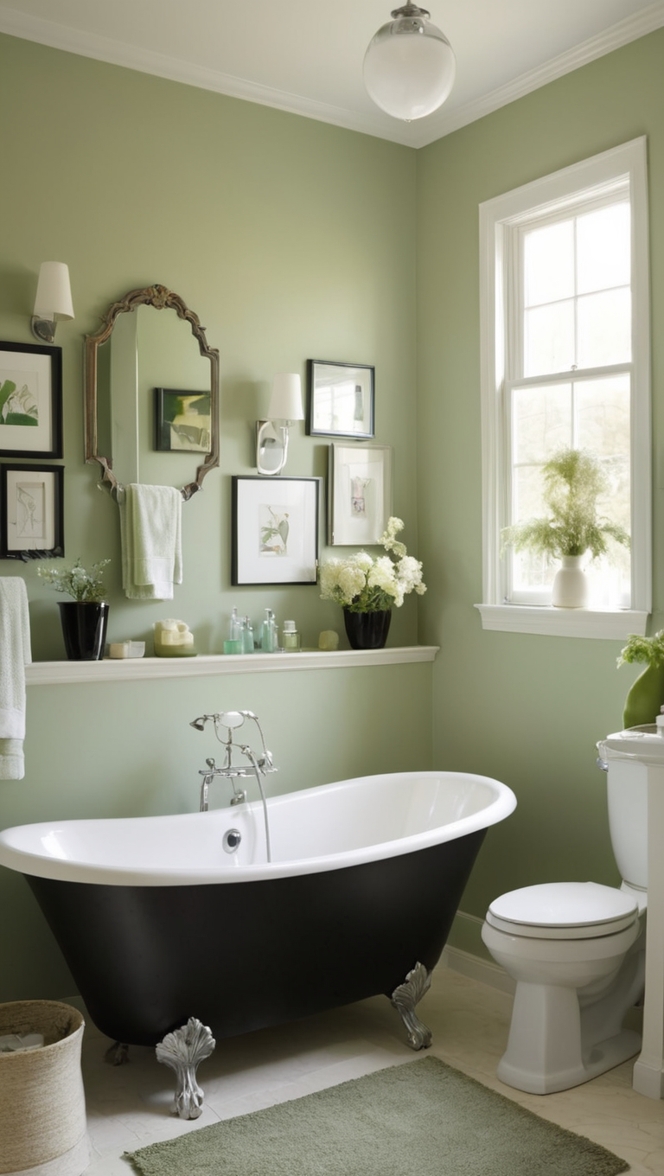
When it comes to avoiding common color palette mistakes in home décor, I have learned the importance of considering the overall feel and atmosphere of a room. In my bathroom, I made the mistake of choosing a bright and bold color palette of orange and turquoise, which ended up feeling overwhelming and distracting in such a small space. I quickly realized that the colors clashed with the serene and calming vibe I wanted to create in the room, and I ended up repainting the walls in a soft shade of blue to achieve the desired effect.
In conclusion, incorporating a color palette design into your home décor is a creative and rewarding process that allows you to transform your living space into a reflection of your personal style. By carefully considering factors such as the room’s function, natural light, existing furniture and décor, and personal preferences, you can create a cohesive and visually appealing design that enhances the overall look and feel of your home. Whether you choose to stick to a strict color palette or mix and match different colors, the key is to find a balance that resonates with your individual taste and creates a space that you love coming home to.

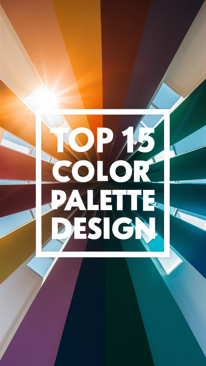
When it comes to incorporating a color palette design into your home décor, there are plenty of creative and unique ideas to consider. From selecting the perfect paint colors to choosing the right textiles and accessories, the possibilities are endless. Here are 12 long-tail keyword ideas to inspire your color palette design journey:
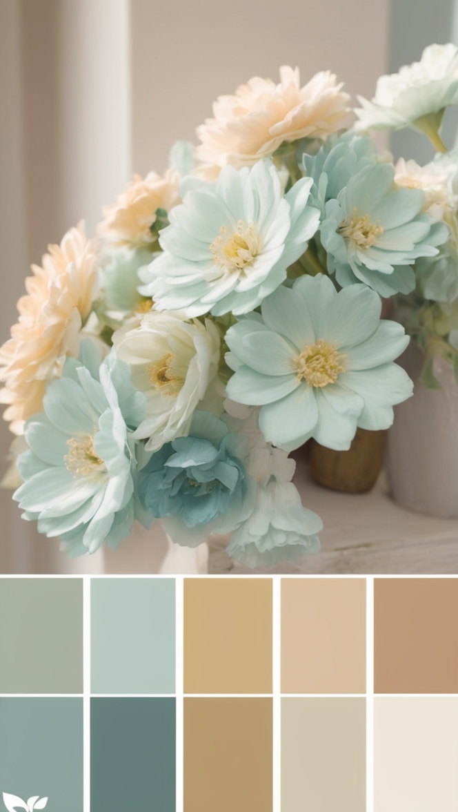
1. **Serene Seaside Escape:** Create a calming atmosphere in your home with a color palette inspired by the ocean. Think soothing blues, soft greens, and sandy neutrals.
2. **Bold and Beautiful:** Make a statement with a bold color palette featuring vibrant shades like hot pink, electric blue, and sunny yellow.
3. **Earthy Elegance:** Embrace nature with an earthy color palette that includes warm browns, deep greens, and soft beiges.
4. **Rustic Charm:** Add a touch of rustic charm to your home with a color palette that features rich reds, burnt oranges, and golden yellows.
5. **Modern Minimalism:** Keep it simple and sleek with a modern color palette of crisp whites, cool grays, and sleek blacks.
6. **Cozy Cabin Retreat:** Create a cozy cabin retreat in your home with a color palette of warm reds, cozy browns, and rustic oranges.
7. **Glamorous Gold:** Add a touch of luxury to your home with a color palette featuring shimmering golds, elegant creams, and rich burgundies.
8. **Pastel Paradise:** Embrace soft pastel hues like blush pink, baby blue, and mint green for a dreamy and romantic color palette.
9. **Muted Magic:** Create a calming and sophisticated atmosphere with a muted color palette of soft grays, dusty blues, and muted greens.
10. **Tropical Oasis:** Bring the tropics into your home with a vibrant color palette of lush greens, bright oranges, and tropical blues.
11. **Industrial Chic:** Embrace an industrial chic vibe with a color palette featuring steely grays, deep blacks, and pops of metallic accents.
12. **Bohemian Bliss:** Get creative and eclectic with a bohemian color palette that includes bold jewel tones, vibrant patterns, and rich textures.
Remember to consider the natural lighting in your space, the size of the room, and the existing furniture and décor when choosing your color palette. Experiment with different shades and patterns to create a cohesive look that reflects your personal style. Whether you prefer a serene seaside escape or a bold and beautiful statement, there are endless possibilities when it comes to incorporating a color palette design into your home décor.